Highlights
Analytics Highlights appear at the top of the Analytics page in the Business Suite.
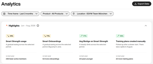
Each highlight is for one key metric, like Smart Strength usage or new Member App users, paired with a short insight about how it changed over your selected time frame. The summary compares your current period to the same time last year, so you can track progress year over year.
Use it to: Understand how your facility is performing across onboarding, member engagement, product adoption, and health outcomes. Each highlight provides a short description of any major changes over the selected period, and links to its detailed graph so you can explore further.
How to use highlights
Highlights are tailored to your configuration. Which highlights appear depends on your facility's product setup and the filters you select.
Each highlight shows whether a metric increased (▲), decreased (▼), or stayed the same (=) over the selected period. The percentage indicates the change from the first to the last month (or week) of your timeframe. If you select only one month or week, the percentage compares that period with the previous month or week.
Click on a highlight to jump to its detailed graph for more details.
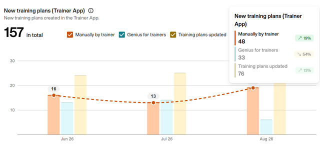
You can also see changes over the time period selected in the full graph format. Hover over items in the graph to see what changed.